

British Fencing - Information Architecture for a Smoother Navigation experience
Project Overview
Participants:
Emma Perry, Antonio Ryan, Jordan Gilbert
Roles:
UX Researcher, Information Architect, UX & UI Designer, Project Manager.
Timeline:
3 weeks
Tools:
Figma, Zoom, Useberry (Card Sort), Ballpark (Tree Test), Slack, Otter, Dovetail, Loom, Google Drive, pen and paper
Project Summary
British Fencing, the UK’s national governing body for the sport, tasked us with an “Information Architecture overhaul” to streamline their website, which was described as “groaning with information.” In a focused three-week agile sprint, we transformed the site into a simple, smooth, and intuitive experience for both new and experienced users.
Throughout the project, my colleagues and I embraced a collaborative approach, rotating responsibilities to ensure shared ownership of research, information architecture, and UI design. This process enabled us to deliver a user-friendly solution to meet the diverse needs of the fencing community.
Outcomes
-
British Fencing, the UK’s national governing body for the sport, tasked us with an ‘Information Architecture overhaul’ to streamline their website.
“Our website is groaning with information.”
“We need a complete information architecture overhaul based on best practice across the industry.”
-
Using a combination of heuristic evaluation, competitive analysis, user interviews and usability testing, we established that users found the amount of content on the website overwhelming, and found the navigation difficult and frustrating to use because it lacked intuitiveness and convenience.
-
The focus for the ideation stage was how we could make the British Fencing website a source of joy, rather than frustration for its users.
The priority was to allow users to enjoy access to fencing information and resources without experiencing the stress and frustration associated with the existing website.
We restructured the two navigation bars to ensure the site looks as users would expect.
Using card sorting and tree testing, we were able to create a more intuitive site map, and a smoother navigation experience for users.
-
British Fencing had expressed a desire to conform with industry standard. Through competitive analysis, we had determined that the majority of sport governing bodies had two navigation bars.
However, through usability testing, we established that in this case, industry standard is not necessarily synonymous with best practice.
Users tended not to notice the content of the top navigation bar and could not find what they were looking for.
To balance this with British Fencing’s desire to match industry standard, we opted to keep to top navigation bar as a place for shortcuts, but also ensure that its contents could also be accessed through the main navigation.
-
“Emma and two other General Assembly students transformed the information architecture of our website. They dived in deep and came up with a brilliant solution informed at all stages by data and research, and aligned with best practice.
They listened to our feedback at all stages, and finished off the work with a focused presentation and a beautifully executed high-fidelity clickable prototype. I thought the points where she led the project were particularly strong and she has a great career in UX design ahead of her.”
~ John Stanley | British Fencing Head of Communications

The Client
British Fencing, the UK’s national governing body for the sport, tasked us with an ‘Information Architecture overhaul’ to streamline their website.
“Our website is groaning with information.”
“We need a complete information architecture overhaul based on best practice across the industry.”

The site
The project began with a heuristic evaluation to understand the site as a whole and potential obstacles users may face.
-
Issues
Vast number of pages with no breadcrumb navigation means users might easily lose track of what page they are on.
Recommendations
Introduce breadcrumb navigation to help users track how they reached a certain point.
Nav bar colour change to indicate which section of the website the user is on.
-
Issues
Website uses technical terminology which may overwhelm new users.
Recommendations
Reduce unnecessary information immediately visible to new users.
FAQ page clarify technical language for new users.
-
Issues
Users have limited options to backtrack and may have to use the browsers back button to navigate. This is likely to be a frequent issue as thin ‘strips’ on nav bar are difficult to select accurately.
Recommendations
Breadcrumb navigation and back buttons.
Especially when the side redirects you to pages without the nav bar.
Increase padding on nav bar or revert to the more commonly seen horizontal nav bar.
-
Issues
A significant number of options in the nav bar are similarly named which may cause confusion for users.
Recommendations
User interviews and usability tests to confirm this.
Card sort and tree test to decide and confirm more intuitive navigation labelling.
-
Issues
All users have to browse the same info, theres no shortcuts/ variations for the different types of users.
Recommendations
Consider how different type of users might navigate the website differently.
-
Issues
Too many options to click on in the main nav bar - a lot of repeated info, users may feel overwhelmed.
Recommendations
Research to inform reduction in content immediately visible on nav bar.
The Users

Next, we conducted interviews to help us understand the users, their motivations and frustrations. This included a mixture of fencers, referees, coaches and parents of fencers.
“It feels like it's been put there by someone for their reasons with things that people might access for their own reasons.”
“If I'm looking for something I'm going to use Google because the menu and the context menus beneath that, they're just really difficult to understand.”
Takeaways:
Users find the amount of content on the website overwhelming
Users find the navigation difficult and frustrating to use because it lacks intuitiveness and convenience
The Usability

The next focus was identifying exactly where users encountered obstacles or felt frustration with the website, as well as identifying well-functioning elements to keep.
British Fencing had identified introducing more people to fencing as a key priority, so it was important to consider ease of navigation for both existing users and those new to fencing. In order to do this, we conducted usability tests with both groups.
Usability testing cemented our understanding that users were struggling with navigation due to information overload and unclear menu hierarchy.
“There’s too much in the menu, I was looking for members and couldn’t find it”
“I wouldn't know which section, which category to go into.”
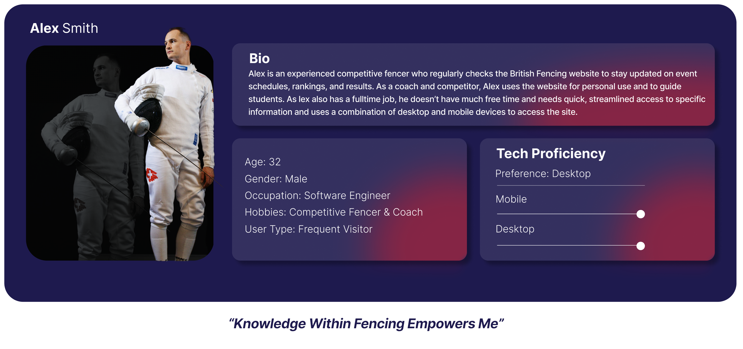
The User Personas
Following user interviews and usability testing, we created two user personas to encompass the needs and preferences of a wide range of British Fencing’s users, including competitors, coaches, parents, and those new to fencing.
Alex was chosen as our primary persona, but we knew it was important to keep Sarah in mind through the ideation process as well, since the client had expressed the importance of new users.
Keeping Alex and Sarah in mind, we ideated problem statements and ‘How Might Wes’ to narrow our focus for ideation.
‘How might we help Alex save time using the British Fencing Website so that it becomes a source of joy rather than frustration?’

The New Site Map
Following the creation of our user personas, we began to focus on how to tackle Alex's problem.
We knew we needed to create a more intuitive navigation system for the site, so we began with an open card sort.
We recruited 20 users, both new and existing, to sort the contents of the site into categories that made sense to them.
Using a similarity matrix, we identified the more common categories to create a new site map which directly reflects how users think, which would ultimately make the navigation more intuitive and better aligned with users needs.

We then conducted a tree test to validate the new site map.
The results gave us insights into what information was easy to find, and what was difficult, confirming whether the restructured categories aligned with user expectations. We then made changes to the site map based on these findings.
Given the short time frame we were working with, we proceeded with the data we had gathered at this point. However, given more time, we would have conducted a closed card sort and additional tree testing to confirm our findings.

The New Site Map
Following the creation of our user personas, we began to focus on how to tackle Alex's problem.
We knew we needed to create a more intuitive navigation system for the site, so we began with an open card sort.
We recruited 20 users, both new and existing, to sort the contents of the site into categories that made sense to them.
Using a similarity matrix, we identified the more common categories to create a new site map which directly reflects how users think, which would ultimately make the navigation more intuitive and better aligned with users needs.
We then conducted a tree test to validate the new site map.
The results gave us insights into what information was easy to find, and what was difficult, confirming whether the restructured categories aligned with user expectations. We then made changes to the site map based on these findings.
Given the short time frame we were working with, we proceeded with the data we had gathered at this point. However, given more time, we would have conducted a closed card sort and additional tree testing to confirm our findings.
The Solution
Key Takeaways
User Advocacy & Client Management
In this project, I developed my client management and user advocacy skills by balancing the needs of a diverse group of stakeholders and the end users. Stakeholders had competing priorities, leading to an overloaded site navigation that overwhelmed users.
By presenting clear evidence from user research, I successfully advocated for a more streamlined structure. This collaboration resulted in a compromise that kept key content accessible while improving the overall user experience.
Industry Standard vs. Best Practice
A key focus of the British Fencing project was to explore best practices in other sports' governing bodies. However, through usability testing, we discovered that industry standards don’t always align with best practices.
While most sports governing bodies used multiple navigation bars, our testing revealed that users often overlooked the content of the top navigation bar, making it difficult for them to find what they needed. This insight informed our recommendations, emphasizing usability over convention to better meet user needs.